Home >> Blog Index >> Blog Post
How do you use data visualisation to tell your story?
Posted on November 03, 2015
Data visualisation is often touted as a good way to improve communication about a set of data. There are many ways to create a picture that will tell the proverbial thousand words, but how do you do this effectively?
This blog post aims to shed some light on the subject via a developing example. When Bryan Habana scored a hat-trick against the USA team in the 2015 Rugby World Cup (RWC) tournament he joined the peerless Johan Lomu at the top of the all time leading RWC list. Let's look at this data.
The list below shows the top 12 try scorers, or all those who have scored 10 or more tries, arranged in alphabetical order according to last name. The data includes the country they played for, the total number of tries and breakdown per tournament.
Adam Ashley-Cooper, Australia, 11, 2007:2, 2011:5, 2015:4
David Campese, Australia, 10, 1987:4, 1991:6, 1995:0
Vincent Clerc, France, 11, 2007:5, 2011:6
Bryan Habana, South Africa, 15, 2007:8, 2011:2, 2015:5
Doug Howlett, New Zealand, 13, 2003:7, 2007:6
Chris Latham, Australia, 11, 1999:1, 2003:5, 2007:5
Brian Lima, Samoa, 10, 1991:2, 1995:2, 1999:3, 2003:3, 2007:0
Jonah Lomu, New Zealand, 15, 1995:7, 1999:8
Drew Mitchell, Australia, 2007:7, 2011:7, 2015:4
Joe Rokocoko, New Zealand, 11, 2003:6, 2007:5
Rory Underwood, England, 11, 1987:2, 1991:4, 1995:5
Shane Williams, Wales, 10, 2003:1, 2007:6, 2011:3
If you are a rugby fan, there is some interesting data in there, but the presentation is not at helpful. You would need a really hard look at the data to glean useful information out it. The main reason for this is that no attention has been given to placement, or positioning of data. Humans are used to understanding ordered lists, as well is interpreting data with the aid of it's position in any presentation. So let's do that.
The data below is now ordered from highest try scorer to lowest, and then alphabetical order according to last name. Then the individual tournament data has been spaced out in a grid positioned left to right in ascending order by year. Furthermore some spacing and alignment have been added.

Now this presentation is quite useful, and most people would be able to gain more value from it. Placement of the data is the key factor that aids understanding. The list from top to bottom has an accepted meaning. You can immediately see which players have scored the most tries. Then as you look at the right hand side of the block you can see how the tries are spread over the different tournaments. This uses "x and y placement" to create a more readable spread. If if you don't understand what the x and y mean, you should gain from the improved communication.
So while this is more useful there is still a lot that can be done to make things better. Let us use size to communicate the relative number of tries, both in the total column as well as the tournament tallies.

So by looking at the relative circle sizes one can get a better picture of the relative number sizes and spread. The total column shows both size and an actual number. In the tournament tally the numbers are not shown because they wouldn't be visible in the small circles, and in helps reduce numbers on the screen which are making understanding a little harder. However in the case where a viewer does want to know more, a mouseover effect can be used to present the numbers - as in the line with Jonah Lomu showing the 7 and 8 tries respectively.
We can use this mouseover effect to reveal even more information.

The mouseover of Joe Rokocoko's 2003 bubble shows that he scored 6 tries, and which countries he scored them against. The mouse over is a great way to present information. This animation adds to position and size bringing in time as the third factor in aiding communication. But wait, there is more. It is still quite hard to assimilate the country information, and most rugby fans enjoy the game through their fierce patriotism.
So let's use some imagery in the form of flags as well as colour to define the countries.
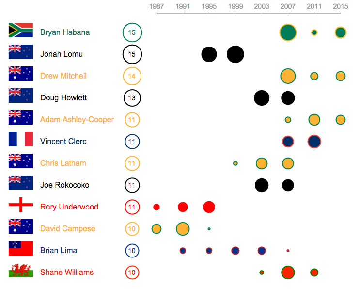
This now allows to quickly see the dominant countries. Flags and team colours are expected to recognisable to rugby fans, so this helps connect players from the same country. One can immediately see the dominance of Australian and New Zealand players in this list.
See the live visualisation here.